UX in the Digital Era: Why Minimalist and Mobile-First Designs Convert Best
As the world moves online, having a website alone is no longer enough. Customers don't remember brands because they offer quality products, but they don't forget them because of experiences. If they like the experience of your product or service, nothing can stop them from coming back.
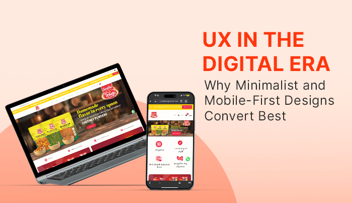
An average user spends nearly 4 hours on a smartphone every day. So, you know where people are, and if you want to ensure that you don't miss out on this market, having a mobile-first web design is not optional.
Mobile-First Web Design: The New Standard
More than half of global website traffic now comes from smartphones. That means a website has to work perfectly on mobile before anything else.
Mobile-first web design focuses on small screens from the start—fast loading, easy navigation, and buttons that work without effort. When a site is built this way, users don’t get frustrated, they stay longer, and they’re more likely to buy or sign up.
By 2025, mobile-first will no longer be a design choice. It’s the basic expectation of every visitor who lands on your website.
Minimalist Website Design Benefits
Websites that load in seconds are the ones people trust and stay on. Slow pages, on the other hand, drive visitors away almost instantly. Minimalist design solves this problem by stripping out unnecessary elements, which keeps performance sharp across devices.
Simple page structures help people find what they want without effort. Instead of getting lost in clutter, they move directly toward the action, whether it is signing up, making a purchase, or exploring more content.
Another clear benefit is focus. With fewer distractions, attention naturally shifts to the call-to-action. These lighter layouts also adapt well to all screen sizes, proving the importance of responsive design in 2025 and helping your site rank better on search engines.
Best UX Strategies for Higher Conversions
Clear calls-to-action make the difference between a visitor leaving and a visitor converting. When buttons are visible and instructions are easy to follow, people move forward without second-guessing.
Personalisation strengthens this process. Showing content or products that match user preferences keeps them engaged and more likely to complete an action.
Another key factor is website conversion optimization through UX. Layouts that feel intuitive guide users step by step. When every element is placed with purpose, the journey becomes simple, and the chances of conversion rise naturally.
Responsive Design Importance 2025
One Experience Across All Screens
Most people no longer stick to one device when browsing. Someone might open a site on their phone during a commute, check it again on a tablet later, and finally complete the purchase on a laptop. If the site feels broken or inconsistent on any of these screens, the experience is interrupted, and the visitor is more likely to leave. Responsive design solves this by adapting the layout to every screen size. It keeps the look and feel consistent, which builds confidence and keeps the user journey intact.
Why It Matters for Modern UX
Expectations around UX in 2025 are higher than ever. People don’t have patience for zooming in, sideways scrolling, or struggling with buttons that are too small to tap. A responsive site fixes these issues by making sure text remains readable, visuals scale properly, and interactive elements stay easy to use. It’s not just about resizing; it’s about creating a flow that feels natural, no matter the device.
Satisfaction That Lasts
When a website feels smooth on every screen, people spend more time exploring and are more likely to come back. Businesses that invest in responsive layouts see stronger engagement and higher repeat visits. This consistency also improves trust—if users know your site works well wherever they are, they’re more likely to complete a form, sign up, or make a purchase.
By 2025, responsive design will no longer be an added feature. It has become a baseline expectation that directly influences user satisfaction and long-term retention.
Choosing the Right Partner
Businesses in Guntur are moving towards websites that feel natural on mobile and deliver results. If you are looking for a website design company in Guntur, the real value lies in finding a team that can align design with business goals.
DT7 has been helping clients shift to mobile-first designs while using the latest tools and methods. The aim is always clear: pages that load fast, respond well on every screen, and support long-term growth.
Conclusion
Minimalist design and mobile-first thinking are no longer buzzwords. They are what make websites convert. People want speed, clarity, and a site that works on every screen. Give them that, and they will stay.
As 2025 moves forward, the real question is simple. Is your site built for users, or is it built just to look good? If not, this is the time to rethink your UX. And if you are looking for a website design company in Guntur, choose one that creates websites people enjoy using.